Complete Application Redesign
I was tasked at redesigning a new clean, modern and easy to use site from this twenty year old legacy system. The original design (left) crammed too much information without proper spacing and caused cognitive overload, as well as vertical and horizontal scrolling. Horizontal scrolling was the #1 major complaint with users. To counter this, I added folding columns as a way to hide information to avoid horizontal scrolling.
BEFORE AFTER
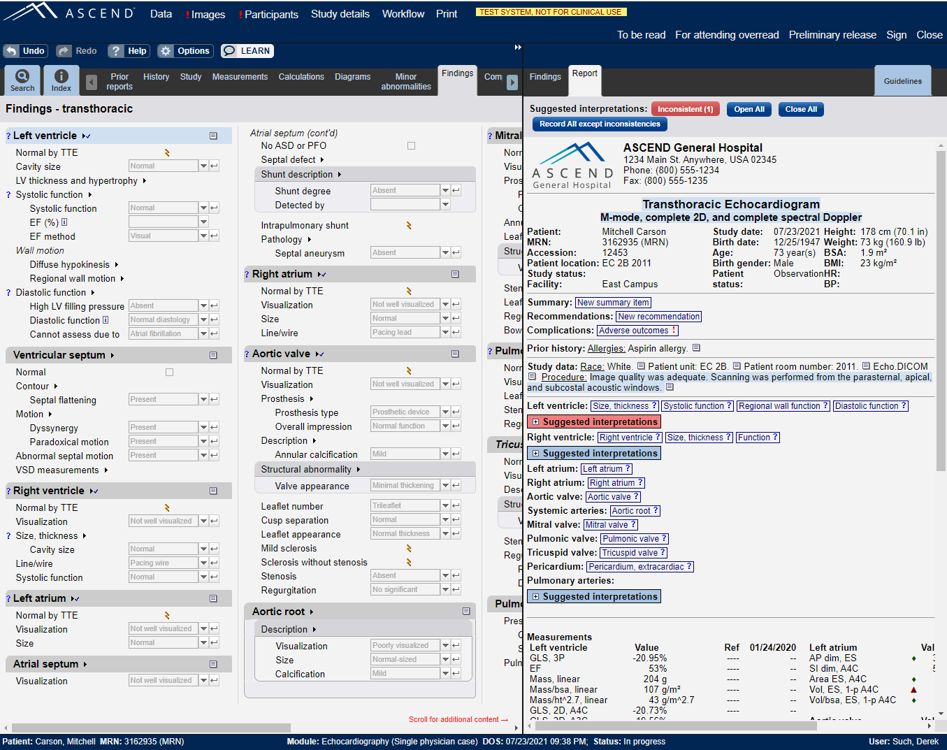
BEFORE
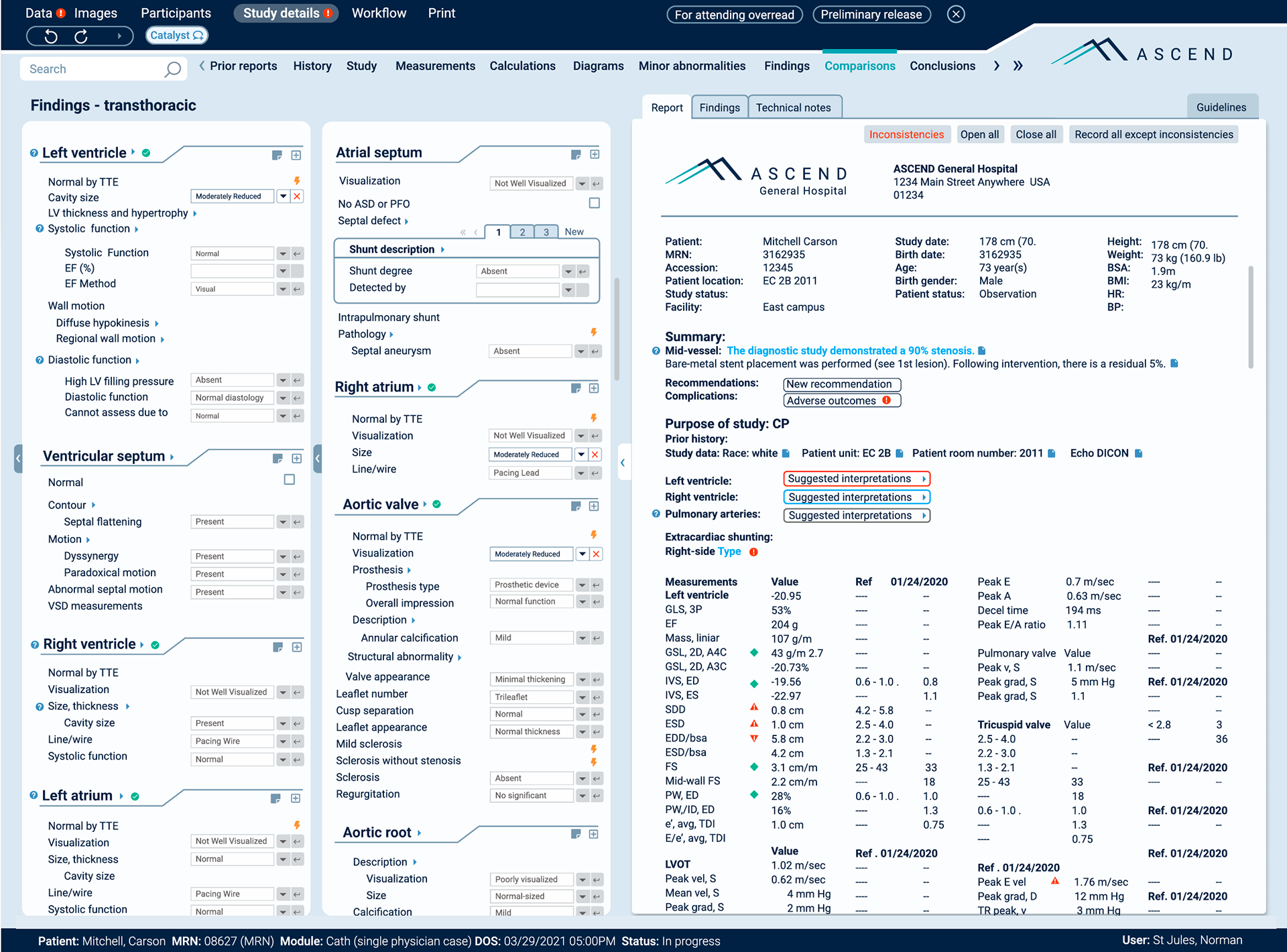
AFTER
Navigation Redesign
Below is a revisit of the navigation structor on the left. The intent is for users to quickly find exactly what they're looking for. The original design had everything up front and displaying too much information. Forcing the user to search and dig for what they need or want. This design was more intuitive and used the Finding Set paradigm with multiple instances, where you can select your instance and then record data into that instance.
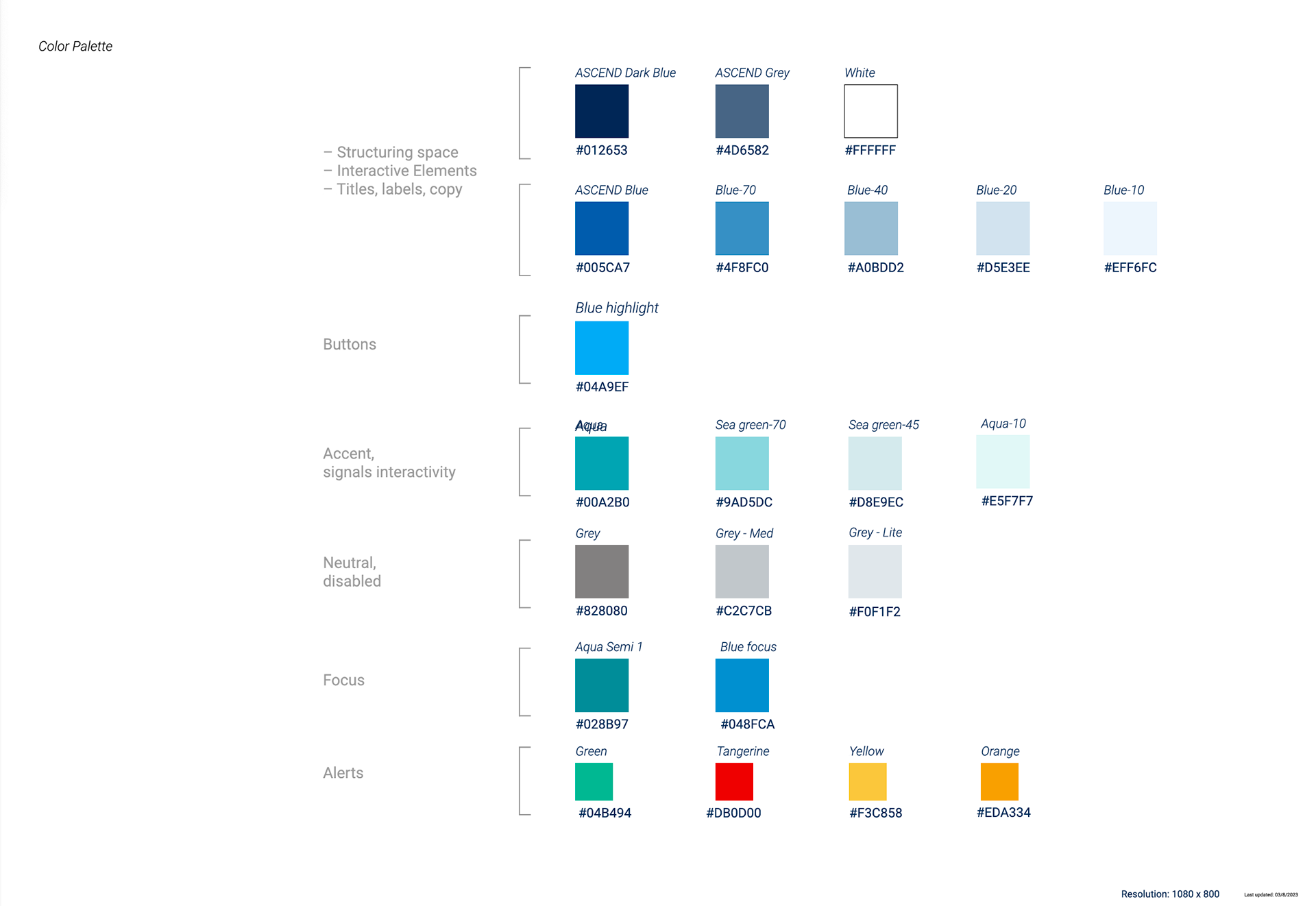
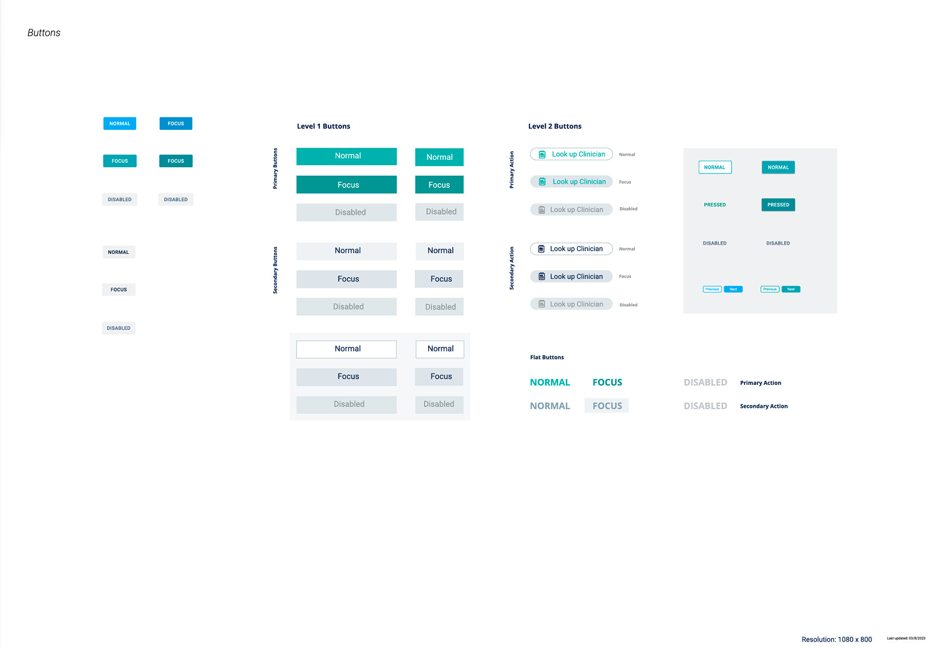
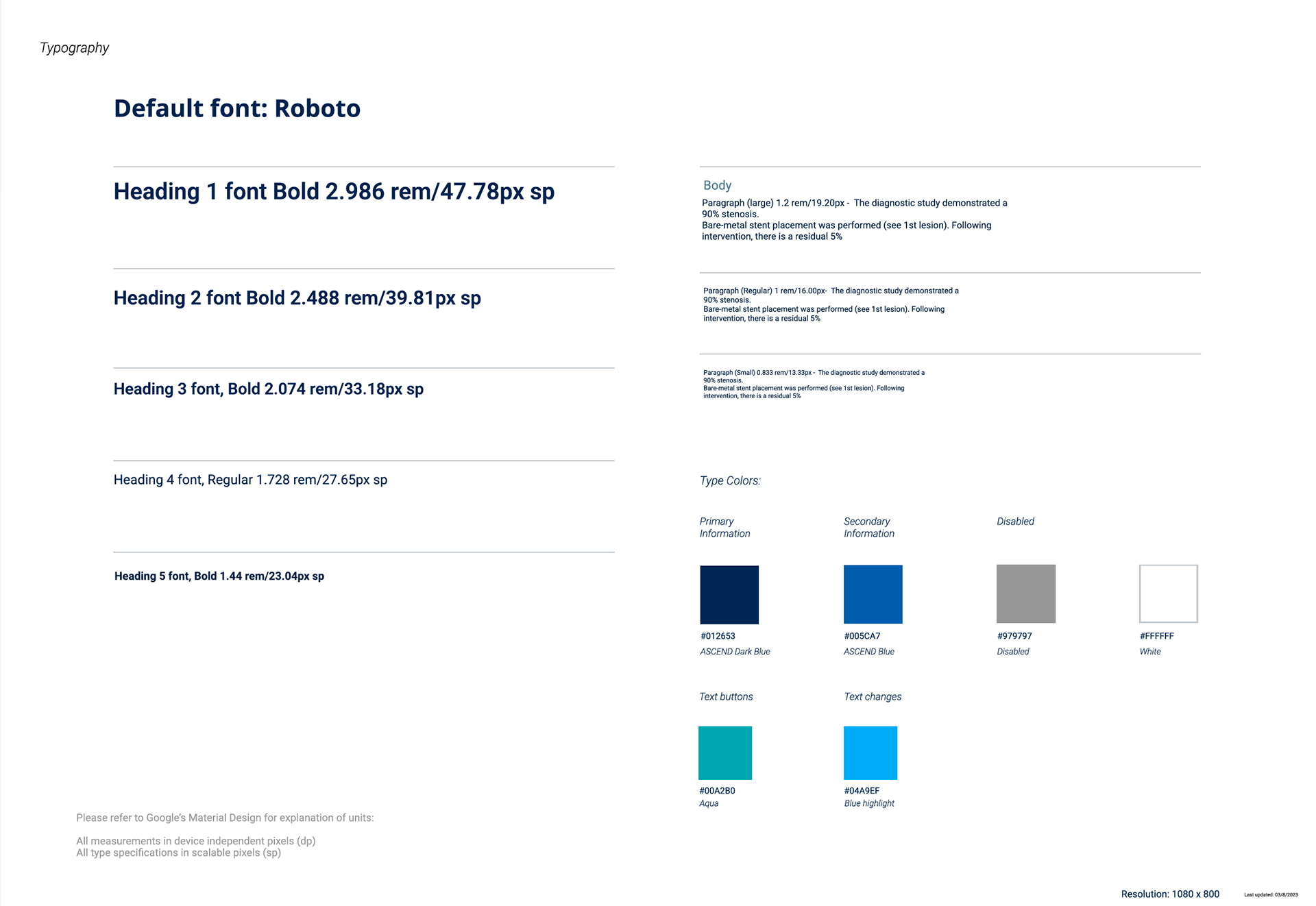
Brand Design Key
Dark mode
Pediatric
Figma was the tool used for developing the ASCEND design system. Creating patterns, variant components, and auto layout provided a lot of flexibility and consistency across all design touch points.
